Seven Door-Hanger Design Mistakes Quietly Killing Your Response Rate
Most Calgary home-service door hangers fail before anyone reads them. Here are the seven design mistakes draining your response rate — and the concrete fix for each one.
The average Calgary homeowner takes about three seconds to decide whether a door hanger gets read or goes straight into the recycling bin. That is not cynicism — it is how humans process unsolicited physical mail when they are juggling groceries, corralling a kid, and thinking about what to make for dinner. Three seconds. That is the entire window your design has to earn the next thirty.
Most hangers fail that window not because the business is bad, but because the design is doing the wrong things in the wrong order. We have reviewed dozens of pieces across trades — junk removal, roofing, HVAC, eavestrough, lawn care, painters — and the same seven mistakes appear over and over, often on the same piece. Each one costs response rate. Some of them cost it quietly, which is the worst kind: you run a zone, get disappointing results, and blame the channel instead of the creative.
This is a design teardown. Each mistake gets a diagnosis and a fix. Most of the fixes cost nothing to implement.
Mistake 1 — Your logo is the biggest thing on the front side
We understand the instinct. You are proud of your business. You want your brand to be recognizable. But the homeowner at the door does not know your brand yet. To them, a large logo at the top of a hanger says exactly nothing. It is a shape. It communicates "this is an advertisement" before they have a reason to care.
The homeowner's first question is not "who is this?" — it is "is this relevant to me right now?" Your logo cannot answer that. Your offer can.
The fix: The offer headline — the thing you are giving them or doing for them — should be the dominant visual element on the front. Your logo drops to the bottom, or runs small at the top as a brand anchor. Think of how newspapers place the story above the masthead, not below. The offer earns the read; the brand collects the credit.
Mistake 2 — There is no real offer
"We offer quality service at competitive rates" is not an offer. It is a category description. It tells the homeowner nothing they could not infer from the fact that you operate a business.
A real offer is specific and has value the homeowner can immediately grasp:
- "Free eavestrough inspection before the May long weekend"
- "Book before June 15 — no fuel surcharge on Red Deer routes this season"
- "First junk haul under 1/4 load: $149 flat"
- "Free attic inspection with every roof assessment"
Specific offers do two things that vague ones do not: they create a reason to call now, and they pre-qualify the caller. Someone who calls about a $149 flat haul already knows your price point. That saves both parties time.
The fix: Before you design anything, write down in one sentence what you are offering, what it is worth, and why they should want it today rather than sometime in the future. If you cannot answer all three, you do not have an offer yet.
Mistake 3 — There is no urgency or deadline
A hanger with no deadline gets set aside. Setting it aside means throwing it away in three days when the kitchen counter gets cleared. "Call us anytime" is the equivalent of no call to action at all — it defers the decision, and deferred decisions become no decisions.
This does not mean you need a fake countdown or aggressive scarcity. It means the offer has a natural expiry that gives the homeowner a concrete reason to act before they forget.
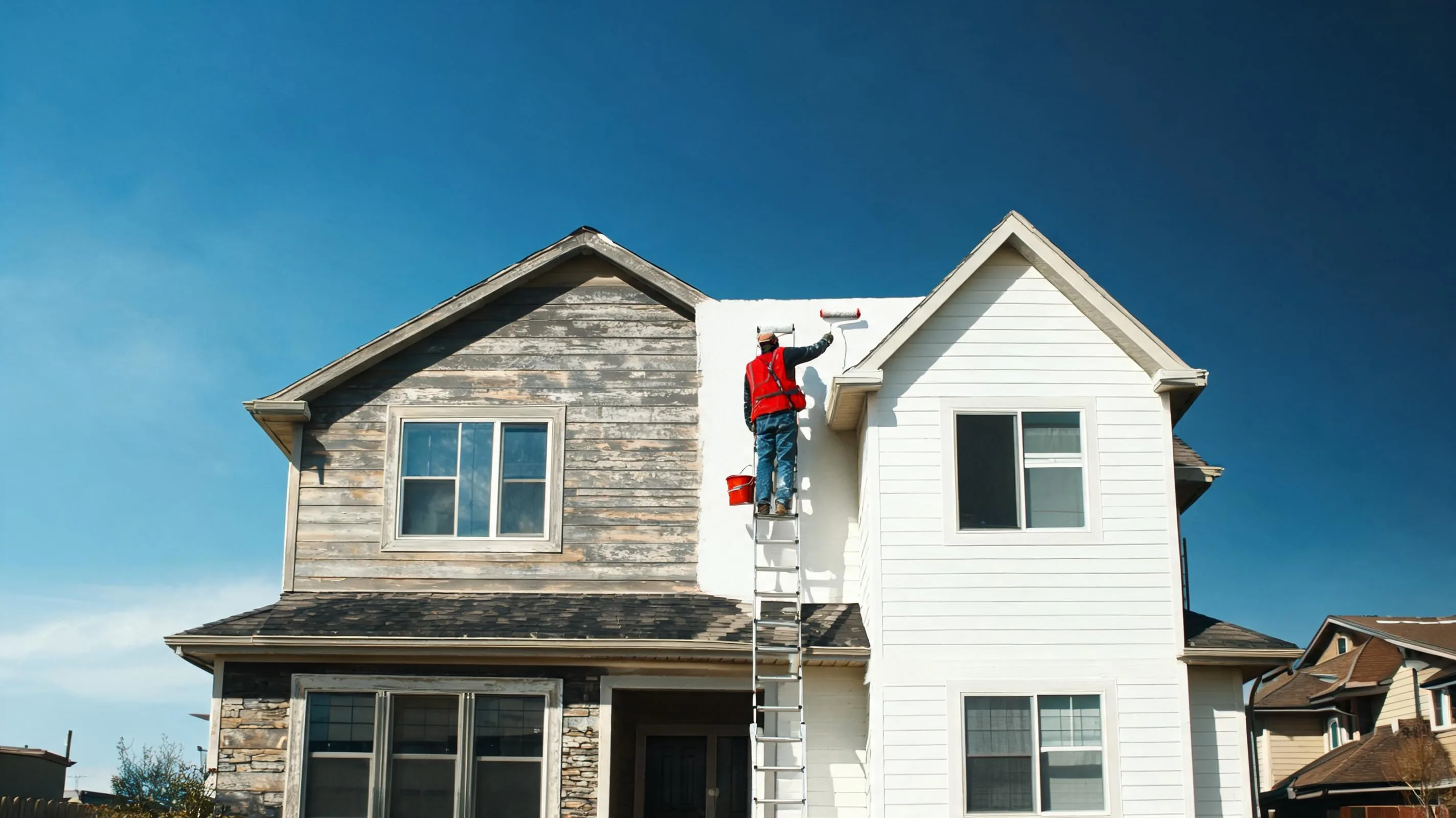
The fix: Tie the deadline to something real. Seasonal hooks work well in Calgary: spring cleanup windows, snow season prep, hailstorm response timing, the City of Calgary's bulk waste pickup schedule. "Crews in your area through May 31" is a genuine urgency signal. It is also true, which means you can say it without feeling like you are running a fake sale.
Mistake 4 — The phone number is buried or undersized
You would be surprised how often this happens. The designer gives appropriate weight to the headline, then runs the phone number in the same point size as the body copy. On a hanger that gets read at arm's length while someone is standing in a doorway, that number is effectively invisible.
The phone number is the most important element on the hanger after the offer headline. It is the only thing that converts a reader into a lead. It needs to be impossible to miss.
The fix: Phone number gets its own typographic treatment — large, bold, set apart from surrounding text. A size that looks slightly "too big" on screen is usually about right in print. Run it on both sides of the hanger. If you are adding a QR code, run the phone number above it, not below.
| Element | Recommended visual weight | Common mistake |
|---|---|---|
| Offer headline | Largest | Logo takes this spot instead |
| Phone number | Second largest | Buried in body copy |
| Body copy | Supporting | Overloaded with credentials |
| Logo / brand | Anchor only | Dominates the layout |
| Trust markers | Icon strip | Missing entirely |
Mistake 5 — No trust markers
A door hanger arrives without context. The homeowner has no prior relationship with you. In Calgary's home-service market — where storm-chaser crews, unlicensed operators, and price-bait schemes are all real concerns — a hanger with no accountability signals reads as anonymous. Anonymous reads as risky.
Trust markers are the visual shorthand that says: this business is real, verified, and locally accountable.
The fix: Run a horizontal strip of four icons near the bottom of the front side. The four that matter most for Calgary home services: a local Calgary or Red Deer address (not a PO box), WCB coverage number, relevant certification or association badge (TECA, BBB, GAF, CFIB — whatever fits your trade), and years in operation if it is above five. You do not need all four if you cannot fill them honestly, but every one you add meaningfully increases call likelihood.
Mistake 6 — The back side is either blank or a wall of text
Most hangers are two-sided. Most businesses use the back side badly — either leaving it blank (wasted real estate) or cramming it with company history, service lists, and boilerplate that nobody reads.
The back side has a different job than the front. The front gets the homeowner's attention and earns the read. The back converts the interested reader into a caller. These are different persuasion tasks and they need different content.
The fix: The back side should do three things, in this order:
- Expand the offer with one concrete supporting point. For a roofing crew, this might be the Class-4 insurance discount math. For a junk removal company, it might be a specific weight or volume example so the caller knows what to expect. One supporting point, clearly stated.
- Provide social proof. One short testimonial — first name, neighbourhood, year — from a Calgary homeowner. Not a generic "great service!" quote, but something specific: "They cleared our garage in 90 minutes, Ramsay, 2025." Specificity makes it believable.
- Repeat the phone number and QR code. The back side reader is the warm reader. Do not make them flip back to the front to find your number.
Mistake 7 — Only one response path
A percentage of every Calgary homeowner population will not call. Some prefer texting. Some will scan a QR code and browse before committing. Some will search your business name before they dial. A hanger with only a phone number abandons all of them.
The fix: Give readers two paths: the phone number for callers, and a QR code for browsers. The QR code should link to your Google Business Profile, not a custom landing page. Why? Because your Google Business Profile already has your reviews, your photos, your address, and your hours — everything a hesitant prospect needs before they decide to call. A landing page requires you to maintain another page and replicate all of that content. Google does the heavy lifting for free.
If you text-enable your phone number, mention it: "Call or text" takes two words and immediately expands your accessible audience.
The compounding effect
Each of these mistakes is meaningful in isolation. But they compound. A hanger with a logo-first layout, no real offer, no deadline, a buried phone number, no trust markers, a blank back side, and a single response path is not just a mediocre hanger — it is a hanger that costs you money. At $349 for a 4,000-door zone, a well-designed piece at 15 responses is a $23 cost-per-lead. The same zone with a weak piece at 3 responses is $116. The design is doing as much work as the distribution.
The good news is that every mistake on this list has a mechanical fix that does not require a brand overhaul or a big creative budget. It requires a clear offer, a hierarchy of attention, and the discipline to let the homeowner's needs lead the layout rather than your brand's ego.
Read more on designing for conversion across industries at /blog/industry/general.
Watch a live Calgary route
Live GPS proof — opens the StreetDrop portal demo.
When your design is right, the distribution needs to be right too. StreetDrop GPS-logs every route — 60+ breadcrumbs per crew, photo proof of placement, and a 94% coverage guarantee. You spend as much fixing your hanger as you spend getting it on 4,000 doors; you might as well know the 4,000 doors were actually reached.